
Timothy Samara, a graphic design genius, says:
Negative space is magical – create it, don’t just
fill it up!
Negative space logos creatively use the white space and create a visual element within a logo. The classic example of a negative space logo is FedEx, in which an arrow is formed from the negative space between E and X.
Negative space is as important as the audible silence in sound designing. It makes the design rich, subtle, and profound.
Importance Of Negative Space In Logo Design
Negative space is not space; it is the audible silence of the visual world. A famous German designer, Jan Tschichold, said:
Whitespace is to be regarded as an active element, not a passive background
It is assumed as a vacuum, but it is more like the air that enables the entire design layout to breathe. You can add a new life to your logos if you play with these blank spaces creatively.
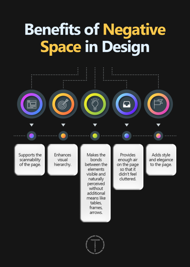
Creatively using white space can enhance design aesthetics. The following are some of the benefits you get by incorporating negative space in your logo designs:
Minimal And Precise
Negative space logos follow the minimal approach, that is: be significant but straightforward. By adding more elements to give depth to a logo design, designers often create complex logos. These logos are not only tricky to replicate on different branding mediums but also are considered outdated. On the other hand, the minimal approach makes up the use of the already available negative space.
More Engaging
These logs have a hidden image, message, or some other visual element that takes the audience by surprise and allures them towards the design. The online audience appreciates such designs and considers them as an art form.
Memorable
A logo that stands out is more memorable than a generic-looking logo. Logos that use negative space are unique, enticing, and creative, making them unforgettable. Therefore, brands that are looking to create a high recall value must invest in negative space designs.
Creative And Enticing
Negative space logos may appear simple but require creative intellect. They are the result of intense brainstorming and thinking out of the box approach. Using negative space to make your logo appealing is a simple yet effective way to make your brand appear more modern.
Unique Design
In the digital era, there are thousands of brands out there competing toe to toe with each other. A brand needs to stand out to be memorable, and the only way to do so is by creating unique-looking logo designs. Using white space to your advantage can boost your overall logo design, making it distinctive and popular among the masses.
How To Ace The Negative Spacing Technique
Antoine de Saint-Exupery states:
A designer knows he has achieved perfection, not when nothing is left to add but nothing left to take away.
Amateur designers rely on heavy design elements to complete their design; on the contrary, the pros let visual appeal be the judge. As discussed earlier, negative space logos are the pinnacle of creativity that requires a designer to be fluent in design aesthetics. Here are some of the tips for beginners to ace the negative spacing method for designing appealing logo designs:
Go Minimal
Minimalistic design means more negative space. Minimal design layouts give you full liberty to play with the negative space to create something unique.
Creatively Use the lines and the Shapes
This is an essential part of creating negative space logos; a designer needs to master the art of using different design elements to give life to the negative space of the design.
Carefully aligning different elements can add meaning to the white space, just like the example of the FedEx logo given above. By creatively placing E and X together, an arrow is shaped between them, making the design complete.
Use Color Contrast To Create Depth
It is advised to use fewer colors while dealing with minimalistic logo designs. High contrast images make it easier for the audience to identify the hidden visual elements in the design. Using low contrast colors will kill the purpose as it will be difficult to decode the subtle, hidden messages in the design.
It is also advised to keep the color palette small as it will increase the complexity of the overall layout.
Highlight The Minute Details In The Negative Space
All it takes is the correct placement of a tiny dot, and you can achieve the negative space effect. As simple, it may seem to look, achieving such accuracy requires planning. A designer needs to plan the entire designing process.
Also, a graphic designer needs to come up with a relevant visual message. The goal is to add to the brand identity, using the white space on the canvas.
Think Out Of The Box
Designing is a creative business; especially now in digital media, audiences want unique and conceptually designed branding.
Negative space logos are only possible if the designer embraces the true essence of the brand message; otherwise, a generic-looking logo will be the outcome. Designing for the digital realm, a designer should be well-aware of the competition and always try to think of something unique and inspiring.
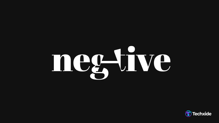
Play With Typography
In the modern design world, graphic designers are adapting minimalism. As the art form is advancing, digital design artists are continuously innovating new ideas. Text manipulation is one of these exciting and unique methods in which logos, visual messages, and other digital content by manipulating the letters visually represent the functionality of a brand. And now, designers are also adding the art of negative space to typography, and we must tell you that the results are mesmerizing.
Types Of Negative Spacing Techniques

Hidden Images
In this technique, designers hide faces in the logo design to give value to their logos. For example, Toblerone has a bear in its logo to link to the city of Bern, the company’s home base.
Typography
Typography is used to create a hidden visual element in the negative space between letters in this method. As mentioned above, FedEx is an excellent example of this type of negative space technique.
Closure
The famous logo of the World Wildlife Fund is the best example of this method. In the closure method, the negative space acts as an outline of the entire logo and combines it with positive space to create an image.
Double entendre
These negative space logos blend the entire canvas, both the positive and negative elements of the design such that it gives two meanings to a logo design. The logo design of Evernote is an excellent example of a double entendre logo design.
Wrapping Up!
Your design isn’t complete unless and until you embrace the negative space on the canvas. In design language, negative spacing means to speak without saying anything. The power of utilizing the negative same adds tons of character and expression to a logo design.
A viewer will find the logo refreshing every time he looks at it because of its mysterious nature. Besides, for sure, negative space logos are cool, attractive, and, most importantly, trending!


Mʏ family members all the time saay that I
am killing mmy time here at web, however Ӏ know I am gettkng know-how everyԁaу
by reading sսchh goοd pօsts.
Its like you read my thoughts! You seem to grasp a lot about this,
like you wrote the ebook in it or something. I feel
that you could do with a few % to pressure the message house a little bit, however other than that, this is excellent blog.
A fantastic read. I’ll definitely be back.
Generally I do not read article on blogs, but I would like to say that this
write-up very compelled me to take a look at and do so!
Your writing taste has been surprised me. Thanks,
very nice article.