I bet at least once in your life; you must have bought the Adidas product, didn’t you? Besides the sporty and durable shoes and apparel, the Adidas logo evolution is a sensational story to cover.
Let The Race Begin
The sportswear industry is a hotly contested battleground where brands fight to brush off their competitors in a desire to win the entire game. Here, brands are constantly recognized and sold by their identity, including their name, products, and logos.
Today, we will gossip about the logo evolution of a famous sportswear brand: Adidas, a company known for its athletic shoes, apparel, and sporting goods.
The Inspired Arena Of Adidas
Adidas production worldwide has reached 379 Million Pairs as of 2020. Brands only survive when they serve their client base with loyalty and an ultra-modern approach to make their presence more alluring and classy. Adidas’ smartly covers the U.S. sportswear market, nearly 6%, and the sports footwear market almost 10%.
The German Giant: Adidas Logo History
When two German brothers [Rudolf Dassler & Adolf Dassler] split up in 1947 after their relations had broken down due to some issues, Rudolf formed a new shoe company that he called Ruda from Rudolf Dassler. Later on, the brand changed its name and named Puma.
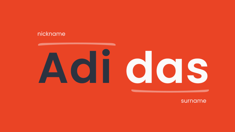
Adolf Dassler came up with a shoemaking idea in 1924. He smartly availed his nickname “Adi” and also the first three letters of his surname “das” to produce the name “ADIDAS.” Next, he registered his company’s name on 18th August 1949.
A different story also refers to an exciting canvas as the original Adidas logo inventor was Karhu Sports. After World War II, Kurho Sports sold out the trademark to Adolf Dassler for €1,600 and two whiskey bottles.
The Fascinating Discovery Of Adidas Logo Evolution
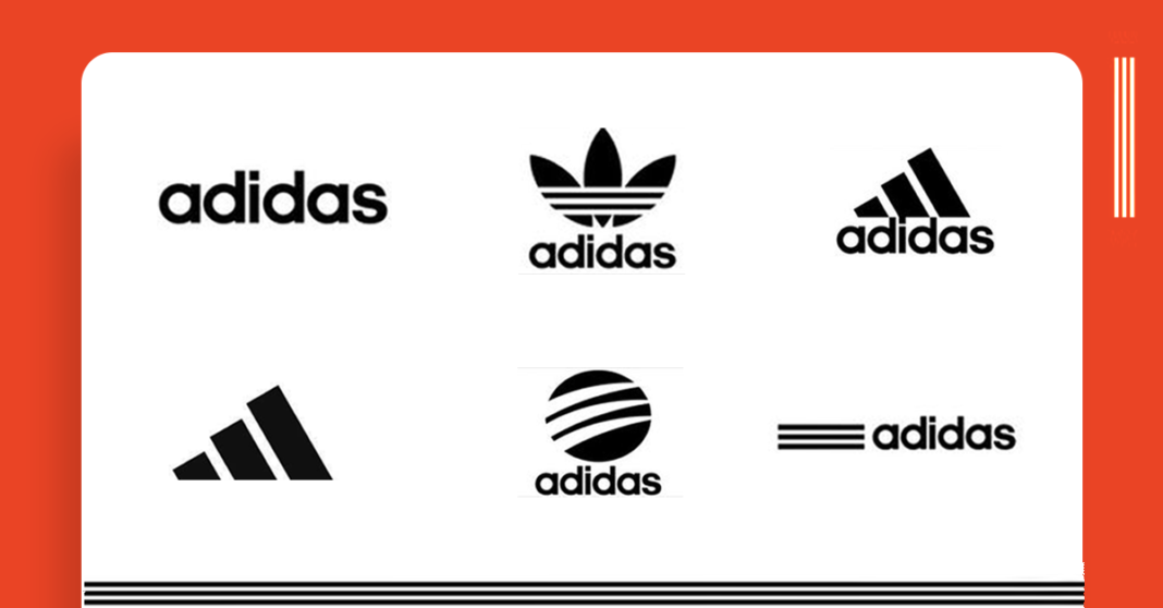
Various kinds of logos turned into reality to represent the brand reputation and later became the successful benchmark for eternity. The following few lines will extend your intelligence by explaining Adidas logo evolution that how Adidas experienced its logo evolution under multiple logo changes.
“LEARN FROM OLD, WORN SHOES AND CUSTOMER RETURNS.”
[ADOLF DASSLER]
-
The Initial Stripes [1967]

Initially, he started utilizing the three stripes to magnify his footwear to make its brand more durable and reliable in 1967. Then over time, Adidas’ logos created enchanting vibes to its customer base and left a legendary benchmark. Adidas also released its first tracksuit in 1967, and recently the brand’s athletic apparel section earned $2 billion in the first half of 2016.
Later, the logo version came from time to time; the trefoil logo is still found in multiple Adidas products. Well, the famous Olympic runner Jesse Owens won the 1933 Olympics championship while wearing Adidas shoes.
-
The Dynamic Trefoil [1971]

Initially, the company faced problems and brand controversies during World War II. After creative brainstorming for an extended period, the brand developed the “The Trefoil” logo that undergoes combination marks. Well, the average footwear segment revenue of Adidas is 13.67 billion USD.
The Logo contained the three stripes that refer to the main landmasses of Europe, America, Africa, and Asia, where Adidas hit the bottles and sold its products at a higher level.
The three lines on the Logo dare to reflect the intensity of diversity to showcase the idea of creative mindsets. The “Trefoil” became the first brand’s corporate Logo to represent its entire image under a creative trefoil logo. Still, people found the trefoil logo on Adidas’s various products.
-
The Creative Mountain Vibes [1991]
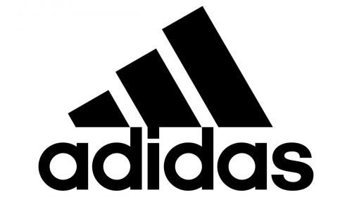
In the 90’s era, the creative director of Adidas, Peter Moore, assisted the ADIDAS in shaping their Logo to a new level. The new Logo represented the mountain-shaped three bards creatively placed in ascending order to create the courageous vibes to chase your dreams.
The new mountain-shaped Logo usually looks like a diamond-shaped figure; still, the Logo has a man’s silhouette raising his arms to expose his euphoria. Adidas operates over 2,300 own retail stores, over 14,000 mono-branded franchise stores, and 150,000 wholesale doors.
-
The Dynamic Neo’s Flicker [2002]

In 2002, Adidas introduced the new brand “NEO” to elevate daily fashion routines and youth styling vibes with sporty looks. The latest logo version [NEO] drives Adidas to the famous designer’s collection to emphasize fashionable and athletic charisma in apparel and footwear. Well, in the 1960’s Adidas also introduced the Shower shoes.
The three stripes dare to cross a black circle while having the brand name under the Logo. Adidas’ new logo evolution represented the most relaxed and refined look in the ADIDAS logo evolution to emphasize its success. The Logo was primarily for the Adidas style collection. After the in-house development success, Adidas also launched its “Smart Shoes” on 10th May 2004.
-
The Three Parallel Stripes [2005]

Since 2005 Adidas did not change its Logo that contains three stripes and refers to the old Logo.
Again, the brand jumped into the simplicity and iconic looks to pay tribute and respect to the founder “Adolf Dassler.”
The new logos’ primary focus is to stretch out the leadership, quality improvement, and gutsy evolution to tackle the brand’s future progress. Adidas now owns Reebok and TaylorMade and is still fixing flaws to augment the brand’s strength.
Wrapping Up The Intelligence
As Adolf Dassler once said, “Never be satisfied with your accomplishments; always continue to learn.” so brands sorely need to revamp their digital strength to undergo its services, products, and logos.
Brands need to think outside the box; only then will new ideas come to you. All brands need to focus on producing high-quality products and keep an eye on brands’ digital appearance.
Logos are the most pleasing and remarkable way to magnet the crowd and build a powerful brand’s image. Suppose you have intentions to make your Logo more charismatic and splendid. In that case, you can hit Techxide (a digital branding agency) to have glorious and ultra-modern logos of any type, anytime, anywhere.


